Lose It! Daily Nutrition Summary Feature
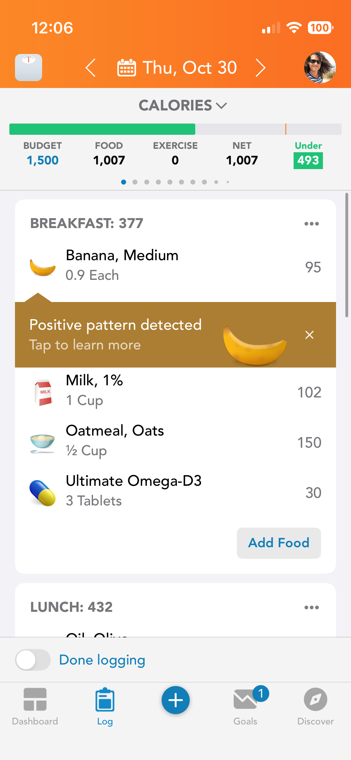
The daily nutrition summary feature that helps users better understand their daily eating patterns and nutrient profiles. The feature displays daily calorie intake and key nutrient data at the top of the screen to help users better understand their progress and stay on track with their health goals. Additionally, calorie and nutrient recommendations for each meal are displayed at the top of empty meal cards so users can plan their nutrition better.
Organization
Lose It!
Project Duration
12 weeks
Team
PM, Designer, iOS + Android Devs
Role
Designer
Impact
Nutrition Summary KPIs
This project resulted in statistically significant boosts in our KPIs:
17% increase in Bookings per Person
30% increase in Free User Conversions
Research
Research and hypotheses
1. The current log header which is a pinned top bar isn’t compatible with iOS 26 or GM3 design systems.
2. Current log header is static and does not drive conversion to paid.
3. Current log header does not display data efficiently and is cumbersome to navigate. Therefore, the new log header would feature a maximum of 3 nutrients selected by the user.
Old Nutrition Summary Header
Interaction Design
Tap Targets
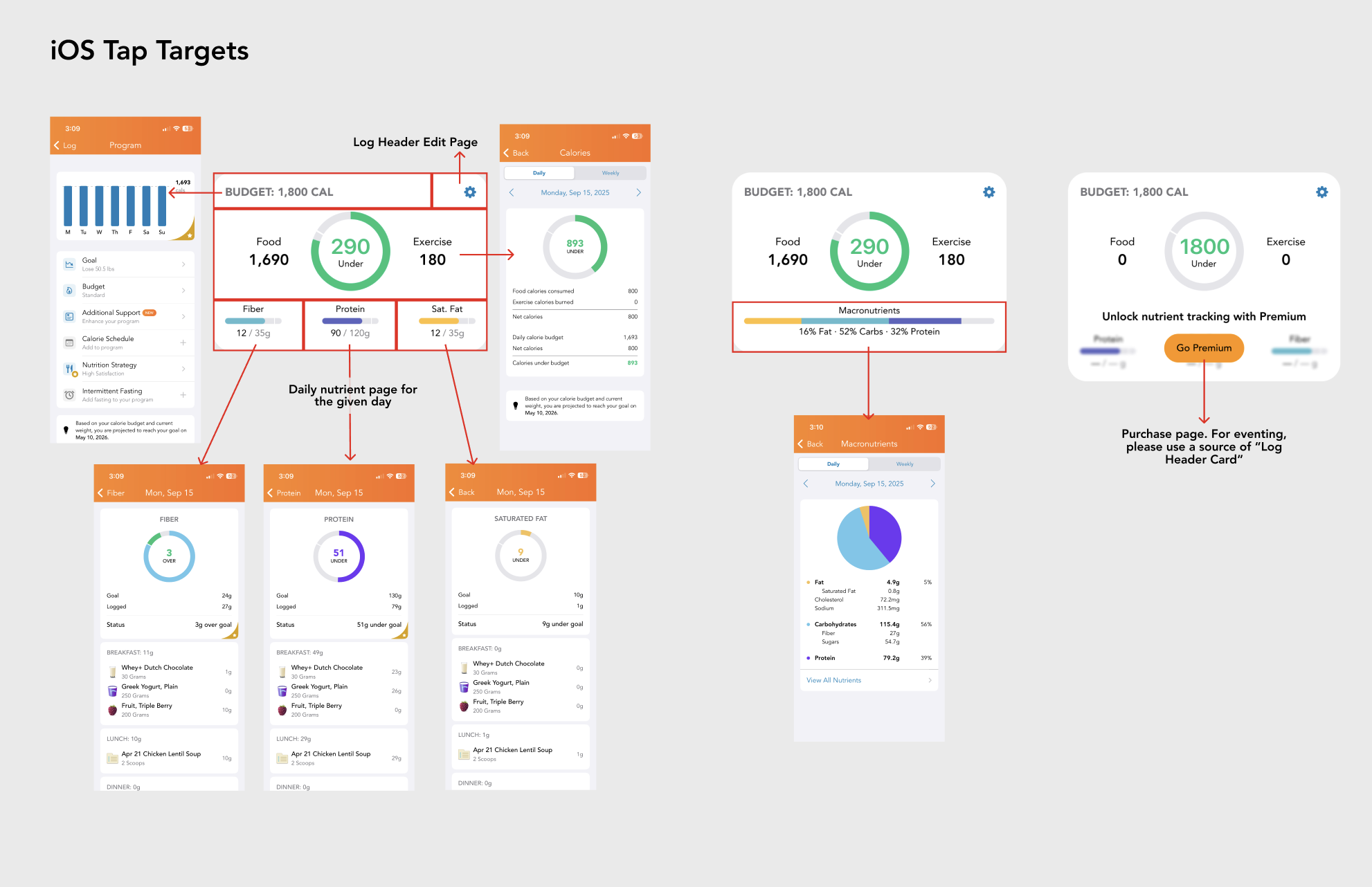
The log header surfaces clear tap targets that turn summary metrics into entry points for deeper analysis. Tapping budget, calories, exercise, or any macro and micronutrient opens a focused, day-specific visualization with breakdowns and progress context. This keeps the overview lightweight while making detailed nutrient insights one tap away.
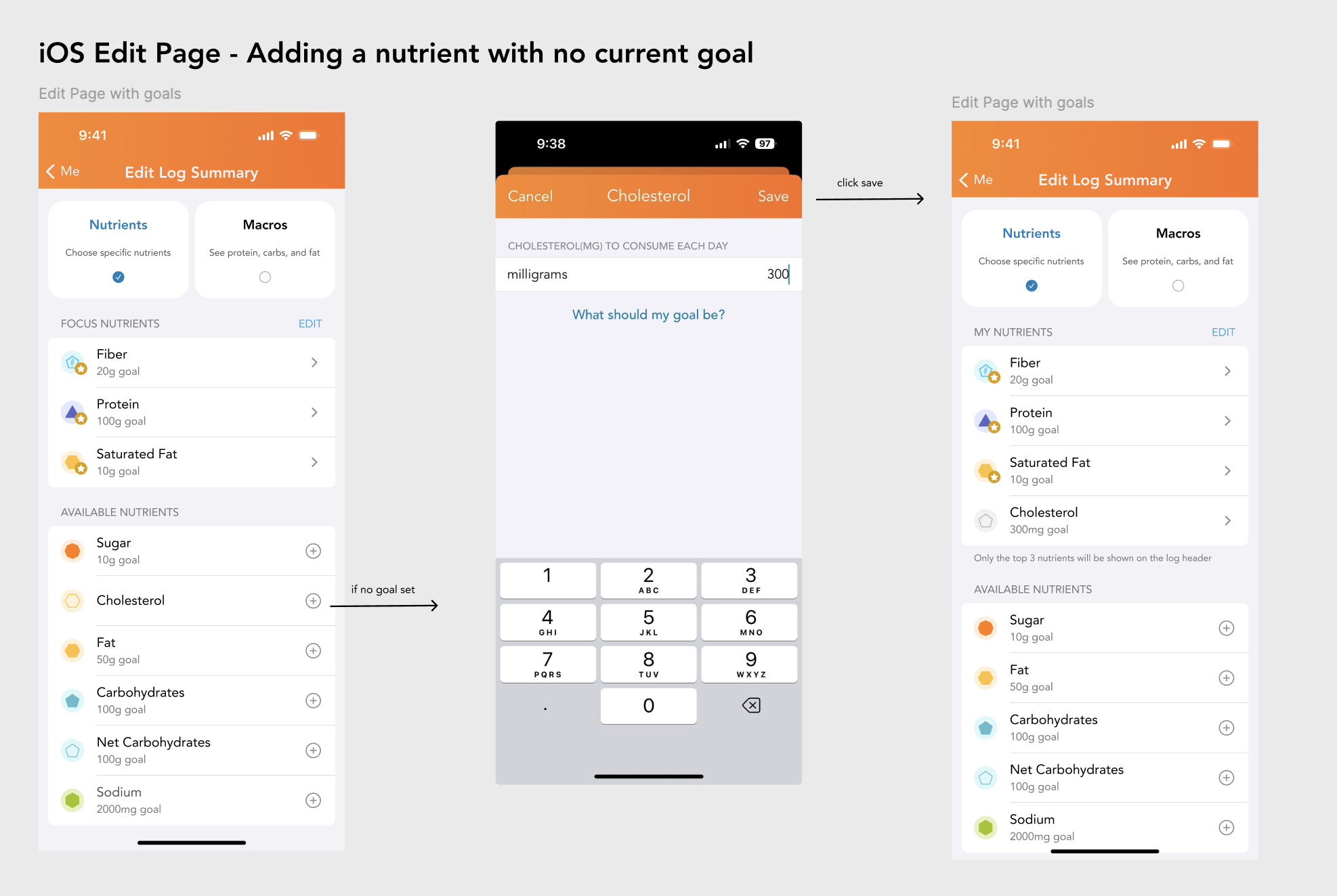
Edit Page UX
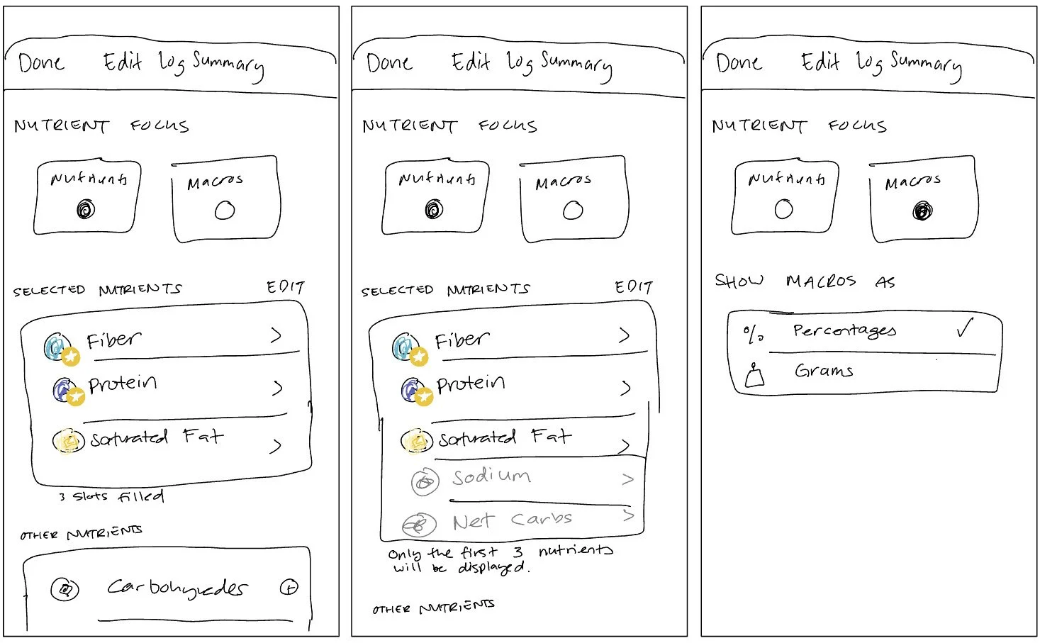
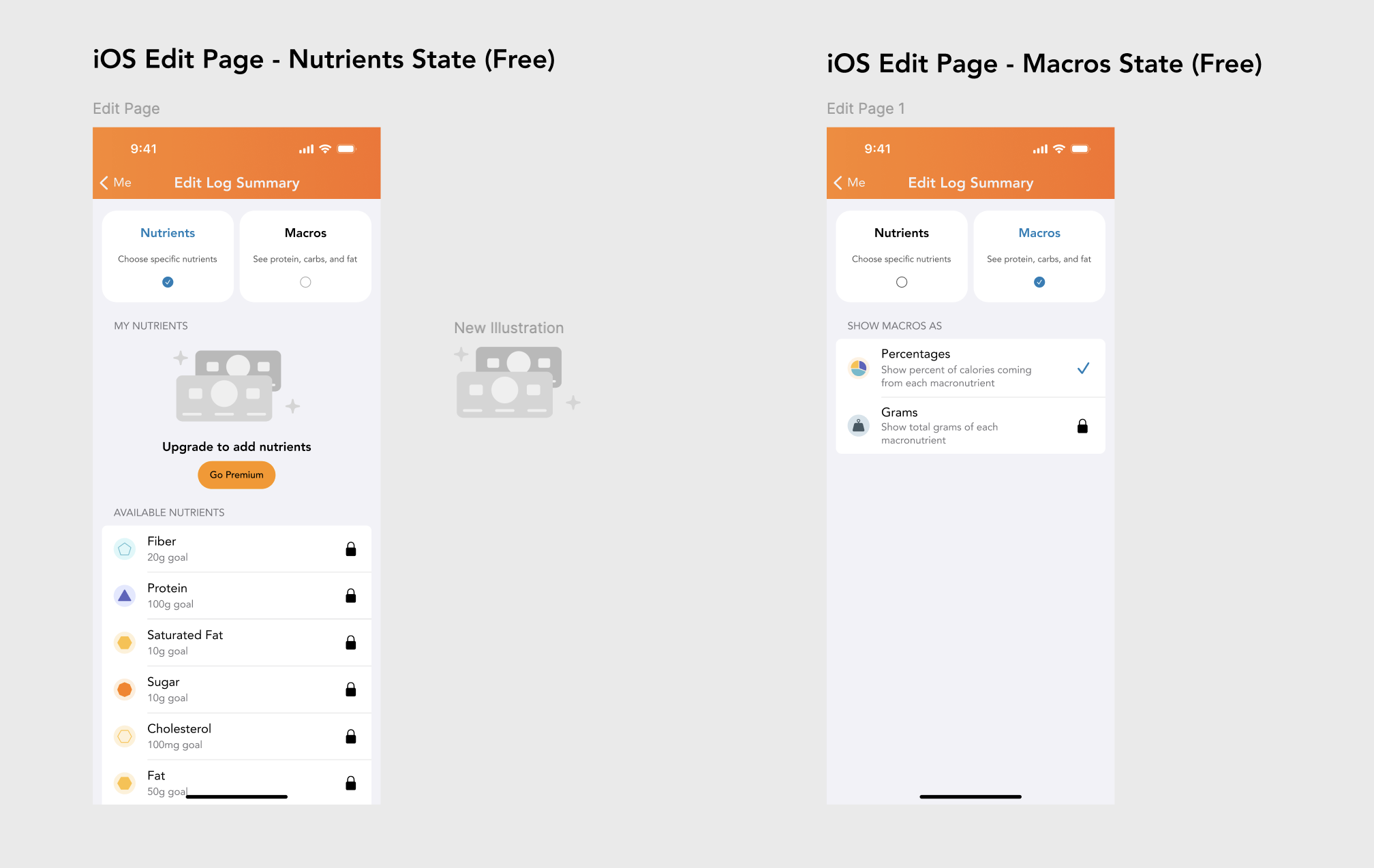
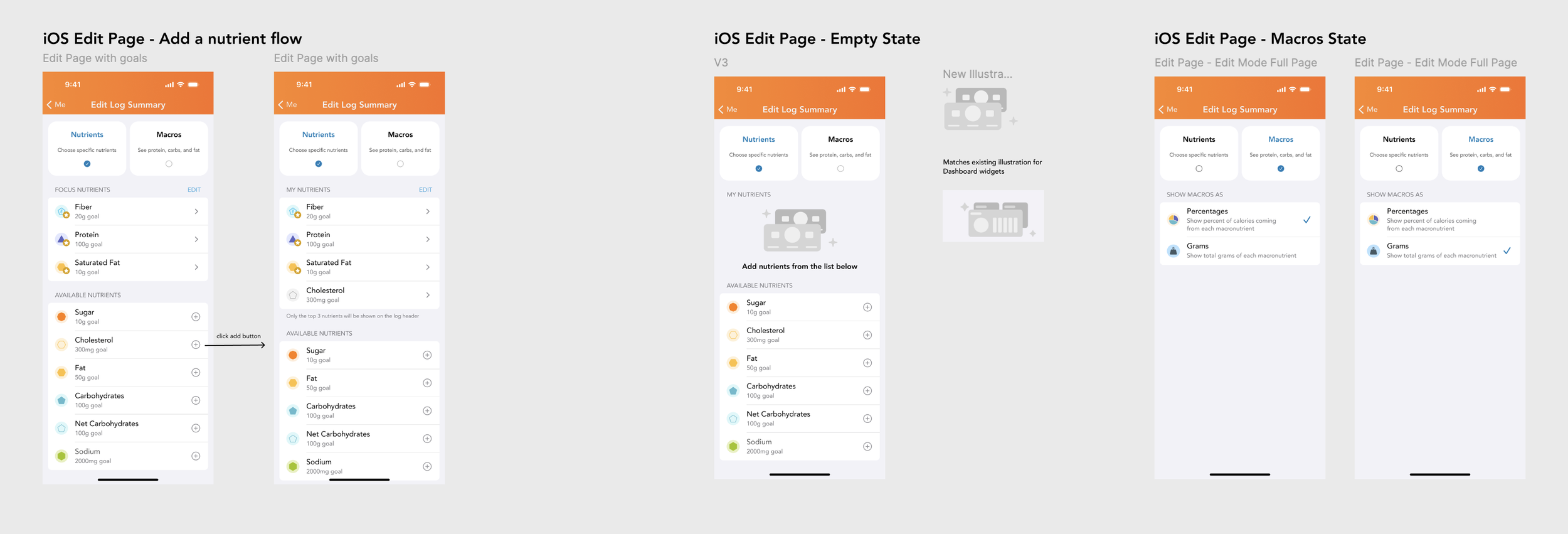
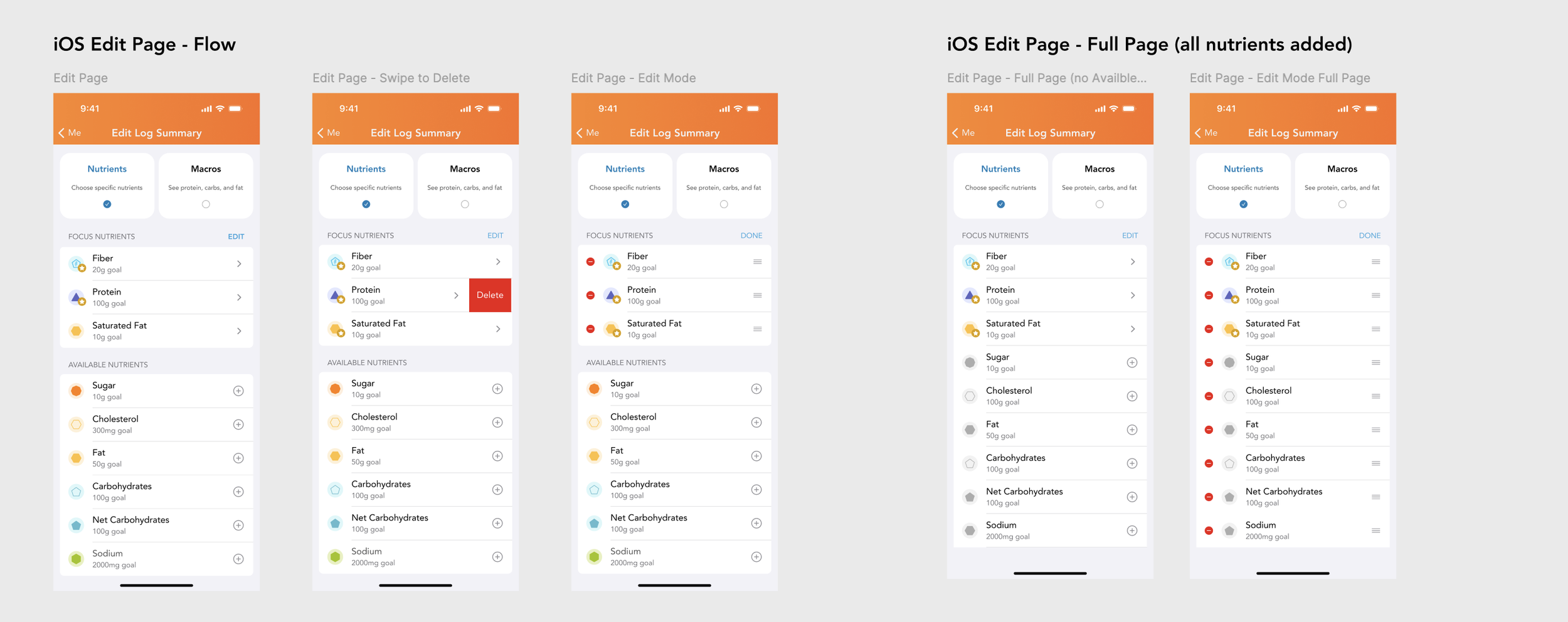
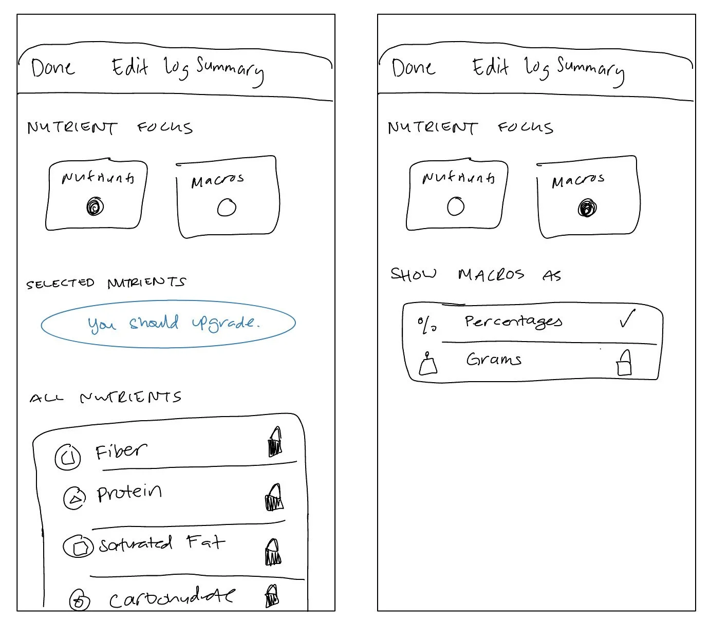
Nutrient Management: Users can add specific nutrients to a "Focus" list, remove them using swipe-to-delete actions, or reorder them via an Edit mode.
Goal Setting: When adding a new nutrient, the app prompts users to set a daily consumption goal (e.g., milligrams or grams) using a numeric keypad.
Macro Customization: Users can toggle how their macros are displayed, choosing between percentages of total calories or raw gram counts.
Monetization Hooks: The design includes "Free" versus "Premium" states, where certain advanced tracking features or specific nutrient additions are locked behind a paywall.
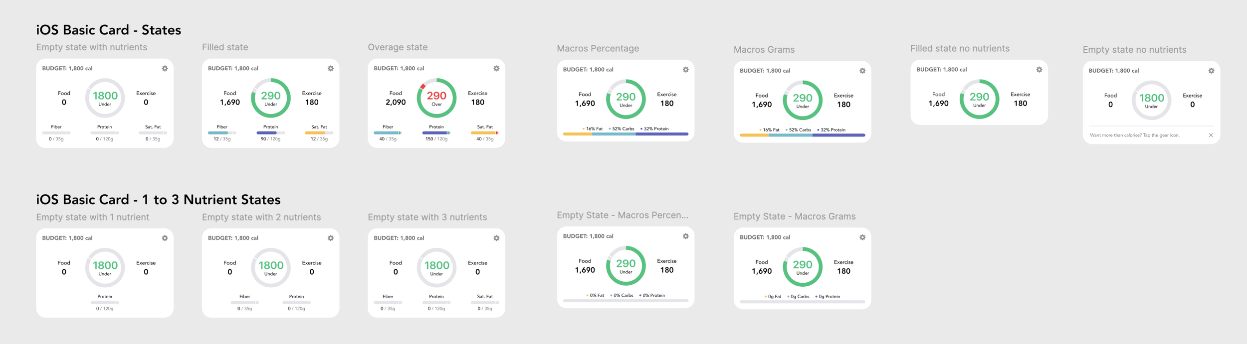
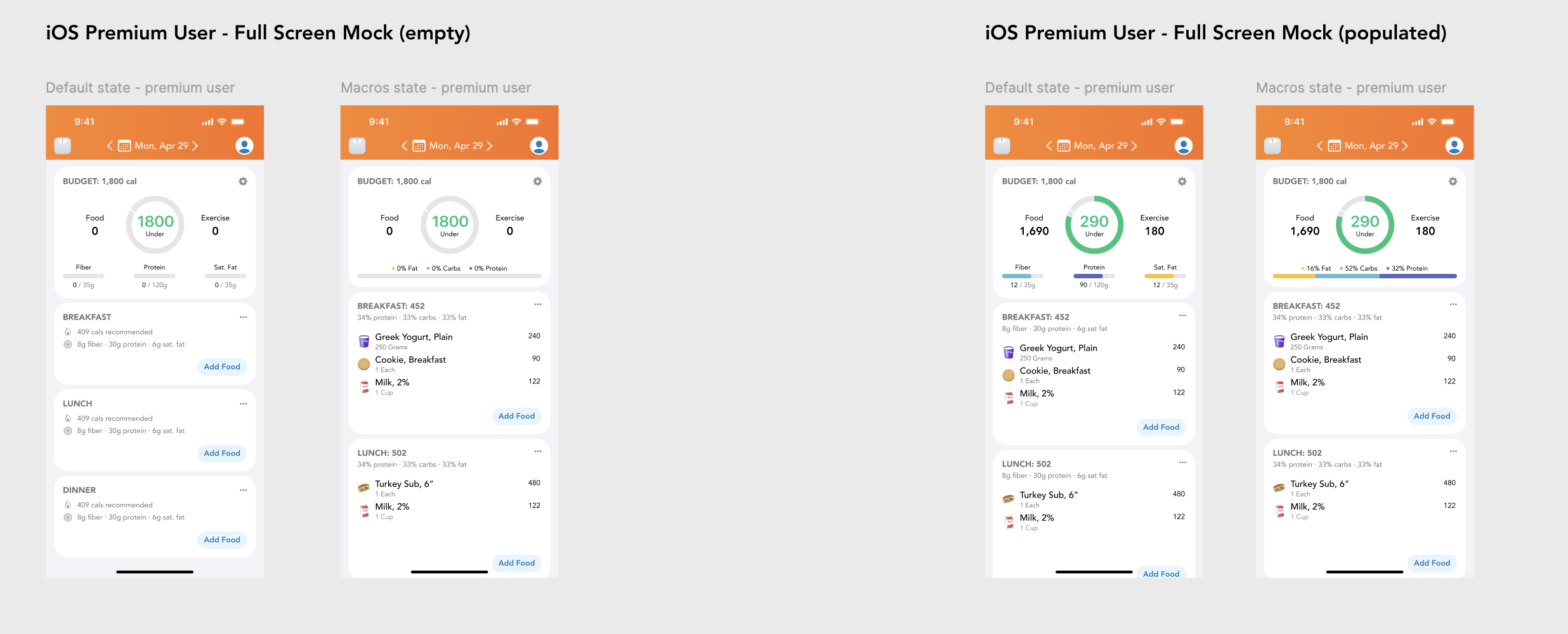
Card States
The log header card supports a flexible set of states that adapt to user context, data availability, and plan tier.
It gracefully handles empty, filled, and overage scenarios, while scaling from zero to three visible nutrients or a macro-focused view without shifting the core layout. Premium and free configurations share the same structural foundation, allowing promos, upgrade CTAs, or nutrient visualizations to swap in cleanly without breaking hierarchy or tap targets.
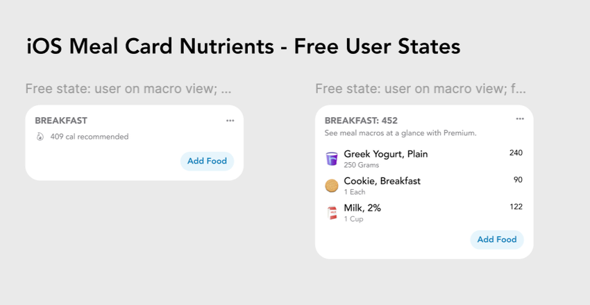
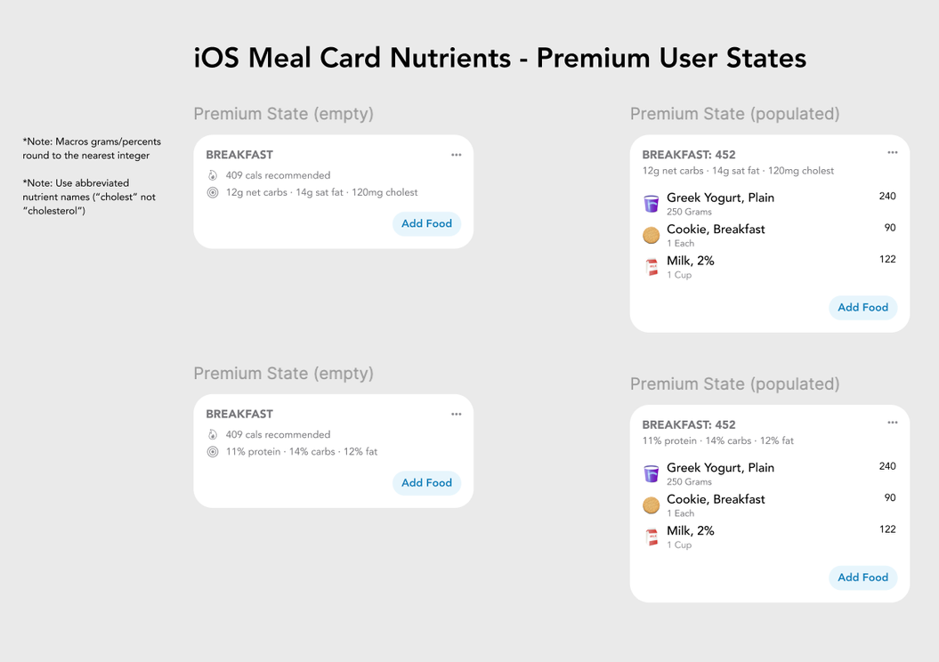
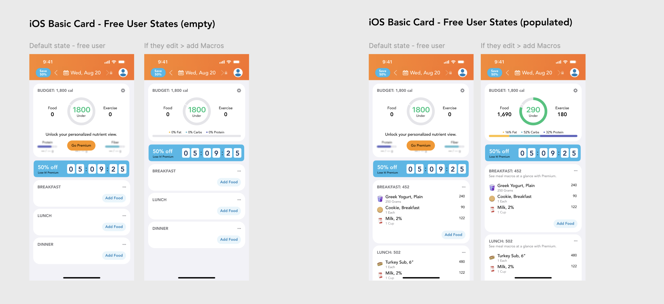
Empty/Populated States for Free and Premium Users
The meal card is designed to scale cleanly across free and premium users while staying consistent in structure and hierarchy. It supports clear empty and populated states, showing simple calorie totals for free users and unlocking nutrient-level detail for premium users without changing interaction patterns. This approach keeps meal logging fast by default, while progressively revealing richer nutritional insight as data is added or access is upgraded.
Early Wireframes
These low fidelity wireframes depict the Edit Log feature which allows users to customize the nutrition summary based on their preferences.
Final Results
Nutrition Summary KPIs
This project resulted in statistically significant boosts in our KPIs:
17% increase in Bookings per Person
30% increase in Free User Conversions