Lose It! Trial Flow
The trial page drives 30% of annual bookings and was due for a refresh. To modernize the paywall experience and boost conversions, we designed a progressive, four-step trial flow. We also created a standalone main page that could be A/B tested against the existing version to validate conversion improvements.
Organization
Lose It!
Project Duration
10 weeks
Team
PM, Designer, iOS + Android Devs
Role
Designer
Impact
Paywall KPIs
This project resulted in statistically significant boosts in our paywall KPIs:
7% increase in Trial Take Rate
3.6% increase in Trial Conversions
Research
Research-guided hypotheses
1. Multi-page flow would convert better since it would reinforce the app’s value and prime users for the paywall
2. Showing a demo at the beginning would increase premium subscription value proposition
3. Adding an exit offer would target a subset of users who are unlikely to convert at the initially shown price
Iterations
Old trial page
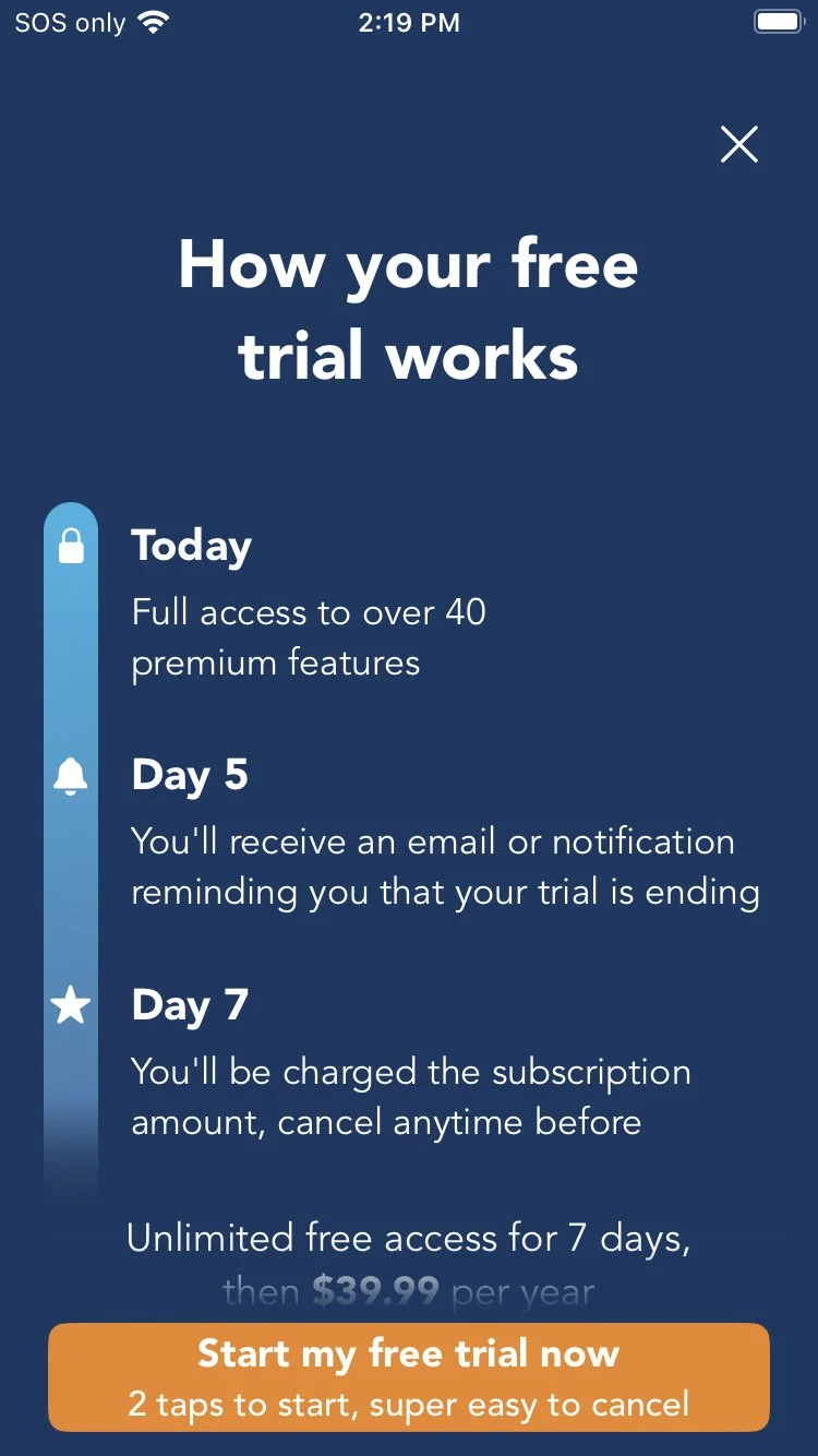

Page #2 - Reminder Page
The goal of this page is to build trust by proactively reassuring users they’ll get a reminder before being charged, reducing hesitation and keeping them moving through the flow.


Page #3 - Main Paywall Page
The goal of the main page is to drive users to start a free trial. To encourage sign-ups, the page highlights social proof by showing how many people use and benefit from the app, explains the trial process with clear, transparent steps, and reassures users with no-risk messaging like “No Payment Due Now.”
The page is designed to scroll. As users move down the page, the close (“X”) button scrolls off the screen, while the purchase block stays pinned to the bottom for easy access.


Page #4 - Exit Offer
The goal of the exit offer is to convert users who declined the initial trial offer by leveraging urgency, exclusivity, and a more appealing value proposition. Our goal for this page is to increase the overall conversion rate for onboarding while maintaining long-term revenue by locking users into an annual plan at a slightly reduced price (triggered when user hits “X” OR if they close the system purchase UI).

New trial page


Page #1 - Product Demo Page
The goal of this page is to spark excitement and build confidence by showing users that success with Lose It! is within reach. Trust is reinforced with reassuring messages like “No Payment Due Now,” eliminating common barriers to commitment. A dynamic video showcases the sleek, intuitive food logging experience, turning curiosity into action and driving users to confidently click Continue.
Final Results
A/B Testing Results
There are three versions that the PM and I tested: the Control = the old version of just a single trial page; New Trial Page Only = a new iteration of a single trial page; Exit Offer = a new iteration of the single trial page, and an exit offer immediately when the trial is declined; and All Elements = all 4 pages.
The new single trial page seems to have a flat or just slightly negative impact on trial take rates. But seems to have very slight edge in trial conversion to paid. However, if we had only tested that element it’s unlikely if we would have moved forward with that as a new version. The exit offer does seem to have a clear impact, in the two groups that had that element it captures an additional ~1.6% of users taking a trial offer.
What was the most surprising was the impact the pre-trial pages had. This resulted in a solid increase in full price trial take rates as well as a bump in trial conversion to paid as well.